


Chichester: In essence, I think that's right. Maybe not strictly from a "creative" level -- which I think
determines a story that feels like it needs to happen. To me, that's a story arc that comes out of straight inspiration. I'd put Fall of the
Kingpin in that category; or Jihad, the Hellraiser/Nightbreed "team-up"; or my run on Nick Fury with Jackson Guice,
where Von Strucker just
kicked the shit out of SHIELD. You're in a professional setting -- you're assigned to create for the title anyway -- but there's definitely a
muse running out ahead of you to frame out the page.
The need for Fall From Grace was, to my mind, more professional. The book was not doing well sales-wise. I think there were some good stories
in there, but they were probably good "one-offs." They lacked a larger vision. (Maybe another couple reasons Tom might have wanted me off the
book.) In retrospect, I have to wonder why we hadn't collaborated on a more comprehensive vision earlier.
I'd never blame Matt Murdock for keeping me in a rut. If there was a failing, it was in not taking full advantage of the character and the
opportunity he and his universe afforded. Maybe I was overextended, and was treating DD too much like one-of-many instead of first-in-class.
That certainly wasn't my perception, then or now, but it's a could-be.
So there was a professional need to DO SOMETHING. For sales. For grounding. To showcase the character -- and ourselves. Attempts to get some
marketing for the sake of marketing -- "Hey, throw us one of them scratch-and-sniff covers that are going to capsize the industry in a few
years!" -- were very much non-starters.
It's important to understand the internal attitude toward the character at the time. While there seems to be a pretty good clip of DD-related
titles and attention now, the company position toward Daredevil then was supremely dysfunctional. There wasn't a lot of interest in pulling him
into other titles, raising his profile. And if it wasn't Frank Miller (and his oft-times excellent work) on the character, they couldn't be
bothered promoting their own title. This was most evident and notorious in the Marvel PR headline for one of his projects (might have been Man
Without Fear, aka DD: Year One): "It's Miller Time!" Aside from mirroring hornhead with beer, and the questionable legality (and unquestionable
creative bankruptcy) of co-opting a brewery's slogan to sell a comic, Marvel in essence was saying, "If Frank Miller isn't writing this book,
it's not worth your attention."
So a combination of situation (some of our own making) and place-in-the-pecking-order drove that need as much as anything. I've referred to it
before as a need to make some noise.
Now, with that in mind, once we had identified that necessity, I'd argue that some very cool CREATIVE things came out of that. And if it hadn't
been Fall From Grace? It would have been another needy Daredevil story. Maybe better, maybe worse than what made it to the page.
It's legitimate to question the ultimate worth of FFG. I've read plenty of reviews that range from laudatory, to laugh-out-loud-hysterical.
Some made me grumble, "You just don't get it!" And some were savagely painful in their hard truths. But I would never let anyone question our
motivation. We loved working on that book and that character.
I remember sitting in a conference room when Scott sketched out that cover to #319. Just the power and surprise of those few bold and
unexpected strokes. It felt like we had something to prove. And we weren't going to go quietly into the night.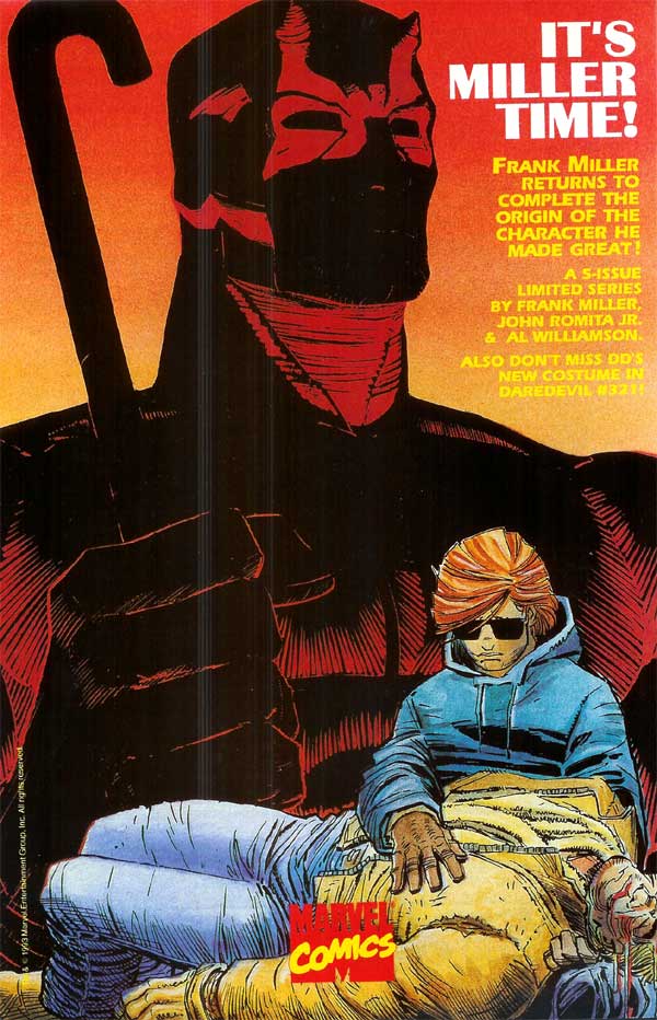
McDaniel: As I mentioned before, I felt I
was at a cross-roads in my career. Specifically, it was an artistic
cross-roads. At that time, the popular
style was the "west-coast" style, featuring a blizzard of fine lines and
cross-hatching and detail lines everywhere. Then Frank Miller
released Sin City with very graphic chiaroscuro styled art. I was
struggling to find my artistic voice, and you can see my internal battle
with
these two competing influences in DD #319, as some pages featured lots
of line detail and others were very graphic. I finally swayed toward
the graphic approach, which helped me compartmentalize the various
technical aspects of drawing (composition, form, lighting). Eventually
I
developed my own vision, but FFG definitely was a positive turning point
in my development. I felt the urge to grow, to develop a unique
style, and to make a name for myself. FFG was a great opportunity to
grow in new areas.
Mithra: Onto something a little different. I'll present some images throughout the interview and you can comment on whatever you'd like. Let's start with #319, the first issue.
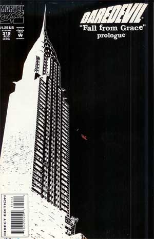
DAREDEVIL 319 cover |
McDaniel: Dan's plots were a pure joy to work from, being full of rich imagery and solid storytelling and
featuring enough suggestions to help the novice penciller along!
The image referenced is the second printing, which is the neg stat of the initial printing (excepting DD is still red!). This composition is
from the fertile mind of assistant editor Pat Garrahy. It was tricky drawing those arches in that perspective - but I managed to get it pretty
close!
Chichester: I can understand the "logic" of making the second printing a reversal of the original. But it has far less impact than the stark black on white of the original. That was (and I'd say probably remains) a pretty bold statement. Especially for what had come before, and what it would have been surrounded by on stands. I doubt the white on black would have stood out as much. Moreso, the negative space conveys something creepy and underworldly. Original: arresting and attention-grabbing. This one: mildly unsettling. |
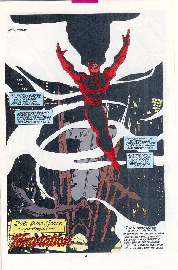
DAREDEVIL 319 pg. 3 |
Chichester: I love how Scott brought the angel wings to the devil in that image. Can't recall if that was in the
plot description, or just a cool McDaniel-ization of the moment. Either way it was and is a really nice image.
A shame it gets bogged down by those ham-fisted chunks of copy. I'll give the writer points for nice intent and sentiment. But somebody should have taken away his thesaurus. You'd think I was being paid by the word with that convuluted sentence structure. Simplify, stupid. There are more streamlined ways of getting where you want to go. Clearer now, it didn't require loftier language to make elevate the narrative. And what was the love affair with the em-dash? Hanging thoughts, disconnected across multiple boxes might seem more organic in the abstract. But on the page it's hard to follow. Rather than let the words simply advance the character and moment, or work in support of, I was giving in to an increasing tendency to try and bring out something that wasn't on the page. Maybe I thought I was layering the story, but it's a short trip from there to fighting against it. This one's not *that* bad. There are worse examples, to be sure. Here's a more economic way of saying much the same thing:
Down below, the raw streets of NYC. This may also have been the first time I wrote the credits as simply "By Chichester & McDaniel," denoting some stronger degree of ownership of what was going on in the pages. Either that, or a nod to hanging together, or most assuredly hanging separately. ;-) McDaniel: This image was beautifully described by Dan in the plot. The smoke as angel wings was definitely from Dan's imagination. This was a tough shot for me to execute - not only a technically challenging visual but also the big emotional start of this big story. It's close to being dramatically powerful, but it lacks the emotive content of a better DD pose. |
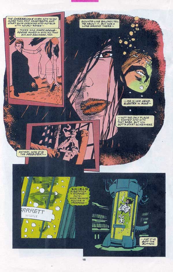
DAREDEVIL 319 pg. 18 |
Chichester: I love all the Garrett sequences. What a giddy, deranged loon. What fun to write. Jumping into it this
way... maybe too much of a hodgepodge of disjointed flashback and assumed knowledge of Elektra: Assassin. The bridge sequence we'd develop for
the trade paperback did a much better job of moving into his story. And ultimately *the* story, given Garrett's role.
Again, the chronic em-dashes and run-on sentences masquerading as "real-speak." Much might be forgiven or improved with a judicious edit or twelve.
The cheesecake knew how to do more than stop heartbeats. One thing: "Sounds like baloney." Baloney? I can't possibly have written that. That had to be a Ralph or Pat edit I didn't catch. "Sounds like bull." "Sounds like b.s." But "baloney?" I'll admit to many sins during this retrospective. That won't be one of them. McDaniel: You can clearly see the drift to the very line-oriented style for the large shot. I tried my best to invoke the imagery of Bill Sienkiewicz from Elektra: Assassin, but it clearly falls far short of the mark! Bill S. is another tremendous artist for whom I have great respect. |
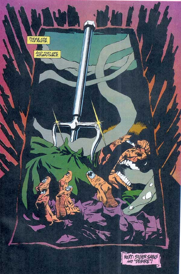
DAREDEVIL 319 pg 31 |
Chichester: Two captions. That wasn't so hard, was it, D.G.? (Well, apparently so.) And I think a nice kicker,
both in terms of a visual surprise and punchy use of verbage. But like I said in response to the first question...this is an essentially ANGRY
sentiment. Chip, meet shoulder. Now try and knock it off. I daredevil ya.
McDaniel: As dramatic as I could make it, this shot marks the return of Elektra! Who else uses that particular weapon?! Pretty awkward, and a mix of line and graphic. That pretty much sums me up at this point! |
Daredevil (and other related characters appearing) and the
distinctive likenesses are Trademarks of Marvel Characters, Inc. and are
used WITHOUT permission.
Copyright © 2009 Marvel Characters, Inc.
All
Rights Reserved. Visit Marvel.com.
COMICS:
Volume 1 | Volume 2 | Annuals
| Appearances | Costumes | Hardcovers | Key Issues | Logos | Origin | Price Guide | Recommended
|![]() Reviews | Secret Identity | Sales Data | Titles | Trades | Untold Tales
Reviews | Secret Identity | Sales Data | Titles | Trades | Untold Tales
![]()
CREATORS:
Cover Artists | Inkers | Pencillers | Writers
![]()
MEDIA:
Books | Cartoons | Computer Fun! | Movies | Music | Pictures | Sketches | Video Games | Wallpapers
![]()
FANS: Fan Art | Fan
Costumes | Fan Custom Figures | Fan Fiction | Fan Guitars | Fan Tattoos
 LINK:
LINK: