PREVIOUS
|
1 |
2 |
3 |
4 |
5 |
6 |
7 |
8 |
NEXT
PAGE 5 OF 8
Daredevil: Fall From Grace -- A Retrospective
(April 2009)
Mithra: Since we're talking about issue 321, let's get right into some pics from that issue. Any more to add about the cover?
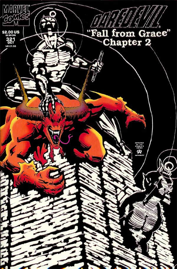
DAREDEVIL 321 cover
|
McDaniel:
To the best of my knowledge, I "invented" the neg stat radar image for DD's
radar when I began my run. Up to that time, DD's radar was rendered as
black lines on a white background. I thought it'd be really cool to invert
that, to better emulate true radar images. I had never seen the radar done
this way, and to the best of my knowledge, I'm the first to do it this way.
This cover utilizes the neg stat radar. Also, notice that the Doppleganger
is not glowing in radar, but rendered normally. That's because DD can't
sense him! When you view the cover in the dark, the Doppleganger disappears
and the building glows, giving you DD's point-of-view!
Chichester:
I didn't quite geek out in the awesome fashion that Mr. McDaniel did, but I do admit to admiring the gritty texture of the glow in the dark ink. And
holding it up to a hot lightbulb to then turn out the lights to check out the cool glow. The negative space really did look pretty cool. And while I
absolutely detested gimmick covers -- well, when it was on one of MY books, then it suddenly seemed okay!
From a storytelling POV, the cover also works really nicely to communicate the whole "You can't SEEEE me!" nature of the Hellspawn in a purely visual
fashion. Which in a way I think is geekier-cool than the glow in the dark deal.
|
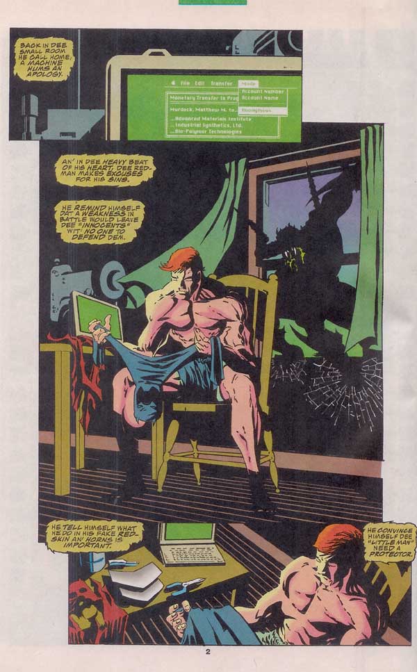
DAREDEVIL 321 pg. 2
|
McDaniel:
The very graphic renderings lend themselves to this part of the story.
Dramatic, tense, forboding, energized. While the highly graphic art can
overpower quiet / restful scenes, it is well suited here. The big middle
panel could have been a bit more dramatic (move the camera a bit to the left
and down, creating a slight upshot and a placing the encroaching
Doppleganger more directly behind Matt), but it's fairly successful as it
is.
Chichester:
I struggled pretty long and hard wondering about the pidgin-creole, voodoo cadence of Hellspawn. Not only how to write it, but whether to do so at
all. Would it seem overly contrived? Would I get it more wrong than right? Obviously, in the end I convinced myself the advantages of a particular
voice outweighed whatever shortcomings I feared in my writing.
And while I think the "dee" and "wit" and fractured syntax are somewhat affected, I do dig the overall vibe of the Hellspawn's attitude. Belitting.
Calling Matt's motivation's into question. It's an interesting, layered counterpoint to his drive to the new duds. It's evil. But also kind of legit.
|
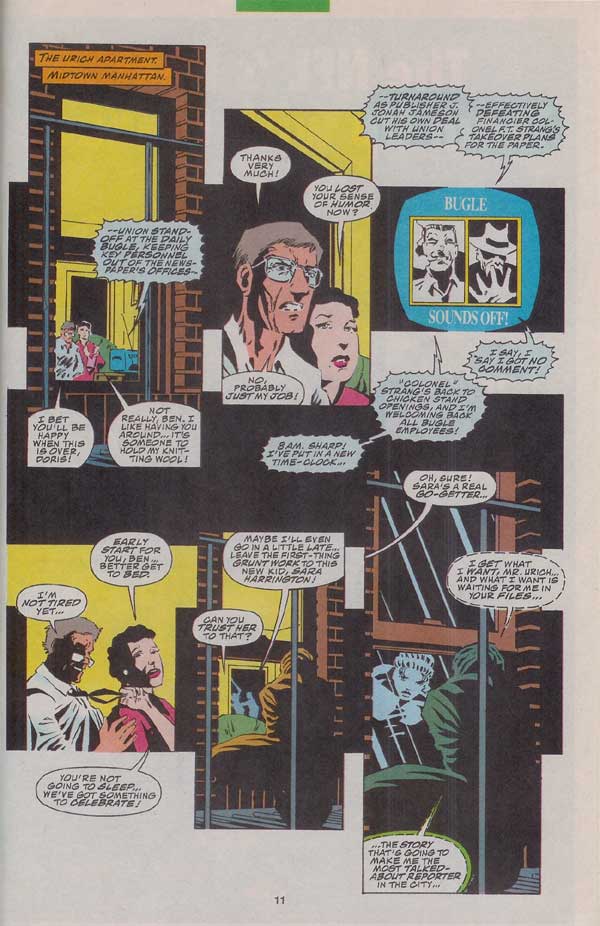
DAREDEVIL 321 pg. 11
|
McDaniel:
Ug. Nasty page. It's poorly designed - I can't even follow the dialogue
properly! A casualty of my inexperience and the Marvel writing method. I
should have made the panel flow far more rigorous. Drawing from the plot
usually means I have no firm idea of the amount of text that needs to be
accounted for. Often when I interpreted the plot, what I thought was a
brief dialogue moment was actually a moment that Dan wanted to provide deep,
heart-felt and incredibly intuitive reflection (translation: Dan had lots to
say!).
Chichester:
There's a lot to like in this page's story. The byplay between Ben and his wife. How the politics and business at the Bugle distracts Ben enough for
Sara to get her in. Unfortunately, it's all too, too hard to find and follow. I don't think either me or Scott are at the top of our game here. The
panel layout seems more arranged for effect, rather than organically flowing one to the next. And the balloons are struggling in that space. It's a
tough journey to be sure which is next in the sequence.
It's the writer's job to place the balloons in this kind of plot-then-script arrangement. So I take responsibility for making those choices. And by
rights I should have written and placed more to the grouping I was given, then to the one I'd have liked. But that would have meant I recognized the
problem at that point in time. And I never felt anything but grateful and inspired by Scott's pencils. As much as anything, he brought out the good
stuff in the page.
So while our combo ultimately doesn't gel here as nicely as it does in some other instances, that observation is a massive retcon on the positive
energy from the moment.
|
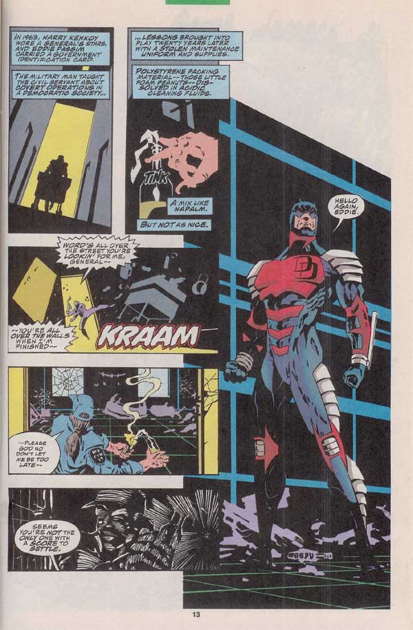
DAREDEVIL 321 pg. 13
|
McDaniel:
Oh brother, another of those left-stacked panel pages! Remember: don't
stack panels on the left!! To feature a large reveal at the END of a page
can often be a difficult visual challenge. The final reveal forces the
image content of the front end of the page to be packed in a creative way,
to make sufficient room for the large final image. If the final image is
suited to the landscape orientation, then no problem! If the final image is
really best presented in portrait orientation, then you have to creatively
pack and stack panels to make room!
Chichester:
I read in an interview with a really cool artist that you should NEVER stack a series of panels on the left to lead into an image on the right. ;-)
This isn't quite in line with some of the other instances of dialogue competing with the art. It's not like the words are trying to tell a story
about ancient Mesopotamia while Scott's moving the panels forward in modern day NYC. But it's a pretty dense chunk of info I was trying to get across
there. There's what Eddie's doing to prep for panel 3, driven by Eddie's relationship with Kenkoy, and how Eddie's training gave him the tools for
revenge.
I don't recall how I plotted it out, and what I suggested to Scott in terms of visuals. And ultimately, that's kind of irrelevant. I needed to do a
better job of taking the images that did come back and attach those to captions or dialogue that told the story most effectively. I like what's being
said here. But I don't think it's very clean. I was never a fan of thought balloons. I don't think I ever actually used them. But a more direct
internal monologue from Eddie would have connected him to the history and what he was up to -- and made things simpler for the reader.
Even if he was muttering to himself...
"You taught me well, General Kenkoy. Covert ops. How to become someone other than myself.
"Steal me a maintenance uniform and supplies. No one notices the janitor.
"Then it's a quick stir of foam packing peanuts in flammable cleaning solution.
"A mix like napalm. But not as nice."
Is that the first panel we see the new costume? If so, bad plotting for the big reveal, Chichester! LOL.
|
Mithra: Back when I first started the site, Scott was very gracious to send me photocopies of his ideas for the new costume.
You can check them out here.
Looking at those costume ideas, do any of you remember how it eventually got to the "armoured" version? Were there any more editorial hoops to go through for this costume? Any particular favourites from this bunch of sketches and why it wasn't the final choice? Was this costume set in stone before the arc started, or was it a last minute choice as it finally got into production?
McDaniel:
I think the sketches started with me trying to design down a two-fold path: 1) a streamlined body suit with biomimetic elements that did not interrupt the body contour, and 2) a more Asian-influenced costume. The results of (1) were insufficiently different than the body suit he regularly wore, and the results of (2) took the costume in a direction that didn't really meet Dan's original intent (DD to wear a significantly toughened - but still somewhat related- costume to hang with physical powerhouses).
Suggestions to increase the biomimetic elements into armor then influenced several more designs. The armor idea was implemented as plates (like bullet-proof vests) and as actual overlapping plates (like samurai or knight armor). Looking over the batch, you can begin to see the buffet-style choices that created the final design:
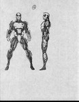 - the chest detail of #17
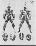 - the leg armor of #18
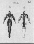 - the head design of round #2 version #3 and the arm and magnetic billy club design of round #2 version #4
At this point, the "who wanted what" is lost to time, but it's interesting to see that the elements of the final costume were all here.
Chichester:
I remember as Scott's ideas were coming in, huddling with Ralph and Pat to review in the office. I was in there more often, and so
was privy to or consulted on what I/we thought as notes and direction back to Scott.
I remember liking how Scott was playing up the Asian influence of things, a nod to Stick, perhaps. But not feeling those worked very
well for the character direction, or were real standouts. (I think you can see certain bits of their DNA cropping up in some of the
Snakeroot designs later on, though! )
There were no additional editorial issues past that point. As soon as we as the DD group were happy with the design, it was a go.
(If there were additional background conversations, I wasn't made aware of them as roadblocks. Although I did have a couple of, "You
sure you guys know what you're doing?" mentions from Stan Lee and (then Marvel Prez) Terry Stewart at one of the Marvel autograph
conventions. But they were just in passing, and I didn't get any truly negative vibes.)
The forearm holders for the clubs was a winner early on. That struck us as a keeper.
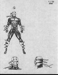 - There was
something about 9 that struck me particularly well -- maybe the flowing bits. But on reflection, the mask was vaguely unsettling.
Especially from the side, it had a kind of bondage feel to it. (Not that there's anything wrong with that! )

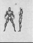 - I recall we
pretty quickly gravitated to 10 and 11 as the best of the bunch. Although we (Pat, Ralph and myself) were all on the same page that
the upward spikes were too aggressive for the character. And with some evolution/improvement/refinement -- there we were! And the
rest is... well, pretty much forgotten, right? ;-)
Continued...
PREVIOUS
|
1 |
2 |
3 |
4 |
5 |
6 |
7 |
8 |
NEXT


 - the head design of round #2 version #3 and the arm and magnetic billy club design of round #2 version #4
 - There was
something about 9 that struck me particularly well -- maybe the flowing bits. But on reflection, the mask was vaguely unsettling.
Especially from the side, it had a kind of bondage feel to it. (Not that there's anything wrong with that!
 - I recall we
pretty quickly gravitated to 10 and 11 as the best of the bunch. Although we (Pat, Ralph and myself) were all on the same page that
the upward spikes were too aggressive for the character. And with some evolution/improvement/refinement -- there we were! And the
rest is... well, pretty much forgotten, right? ;-)


![]() Reviews | Secret Identity | Sales Data | Titles | Trades | Untold Tales
Reviews | Secret Identity | Sales Data | Titles | Trades | Untold Tales![]()
![]()
![]()