


Mithra: Okay, we're past the halfway point... let's look at issue 323...
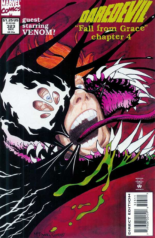
DAREDEVIL 323 cover |
McDaniel: This composition makes more immediate story sense than the previous one - DD becoming
overwhelmed by Venom. The painted parts were by Pat Garrahy using watercolor, and Matt's face was by me using colored pencils. I
remember working so hard on that face (I know, it certainly doesn't show!), creating layer after layer of color, building it up as I
went. Mostly I remember the terror when I realized the waxy medium of the pencils had formed a nearly impenetrable barrier over the
face, making it impossible to continue to add color! So, it stopped here (and maybe we should all be grateful!). The idea is pretty
interesting, but my artistic ability to execute it left a lot to be desired! Thanks again to Ralph, Pat and Dan for the willingness
to experiment so a knucklehead like me can... you know the rest!
Chichester:
I did NOT know all the waxy goodness drama of Scott's artistic exploration! |
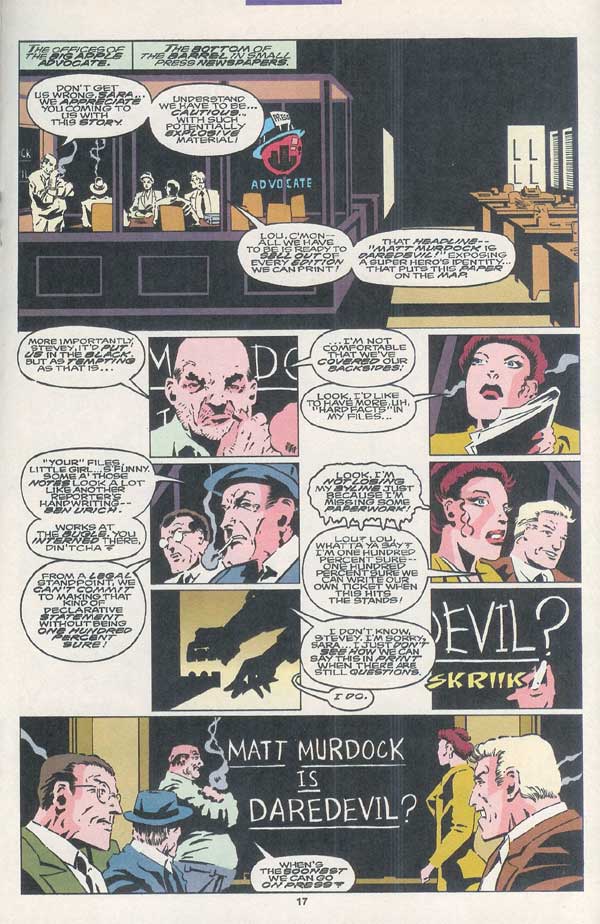
DAREDEVIL 323 pg. 17 |
McDaniel: Man, I wish I had worked a little more closely with Dan on the execution of these pages!
There is a lot of information to present, visually and textually, and the flow is certainly awkward at times. The main culprit is
the plot-art-script method used here, but we certainly could have overcome it.
The idea behind the page composition is simple: the first image is the establishing shot (shows the reader where the characters are and their spatial relationship to each other), and the last shot is the big climax. So, the first and last images get priority on the page. The remaining six images carry the exposition. My choice was to make them all identical in size, and spaced out so give the dense page some breathing room. However, the story didn't quite flow at those six beats, creating some jammed areas. Nice idea, but forcing balloons hang out in the nether space between panels is just ripe for confusing the reading flow.
Chichester:
I'm going to mostly suck up to Scott's earlier comments about this set. I really like the way these characters are portrayed. Even though they're all
just supporting players, I'm pleased with how the dialogue captures a good sense of who they are, how they work, their anxieties and greed. And the
build toward Sara's own ambition and her solve for it pays off in a particularly oily finish. But the balloon flow is confusing. If I'd managed to
keep them contained to the grid of the panels we would probably have been okay. But once the 3rd balloon in panel 4 intrudes down into panel 6's
personal space -- the reader's tracking is off.
What's odd to me is why Scott and I didn't consult on this more. We chatted a lot, and I think had a good creative rapport. I felt of my many
collaborators, Scott was one I had an especially nice back and forth with. (Am I fooling myself all these years later, McDaniel?) So why we didn't
chat about this kind of stuff -- don't know. The peculiar nature of the plot-pencils-script mechanism? Or we just had our heads down to the next
issue?
Well, you can probably grok this one in at *most* 2 reads. ;-)
|

DAREDEVIL 323 pg. 19 |
McDaniel: Man, when you read a Chichester comic, you'd better have a comfy chair and a sandwich! You
definitely get your bang from your buck!
I still remember the starkness of the scene, and feeling uncomfortable dealing with the mature subject matter. It certainly makes sense with the Hell's Kitchen backdrop and Karen's background, but it was a bit unsettling. Compositionally, it is similar to page 17. This page features an "inset" over the establishing shot, the climax of the page occurs at the last panel, and the rest of the panels are designed to flow across the page at a steady beat. Here, however, the text is mostly contained within the panel borders.
Chichester:
I was pretty pleased with myself on exploring Karen's troubled tale as a storytelling avenue to get to the issues of pornography, and from there
free speech. Both as an abstract, and from a legal point of view, against the trappings of the book's lawyerly cast. But really, it had no place
here. What a lot of blah-blah-blah and where do I go next in those first coupla panels. I know what I (or rather *that* D.G.) was doing: I was
looking to set up things for future issues, layering the storyline, keeping the supporting cast alive.
Except with the overall density of FFG, it's a miracle this wasn't the point at which the atomic matter collapsed into itself and the whole thing
went super critical. Kudos to Scott for sticking with me! Although he may have been an enabler at that particular point. LOL.
The thing the story needed to move to itss next point was Foggy's concern for Matt, and going to Karen to address that. The moment should have opened
and stayed on them -- either from the pretzel stand or a similar setting -- and just kept its focus there. Once it's on them... not bad. But I
imagine
it
caused more than a bit of "Wha?" to get to that exchange.
|
DAREDEVIL 323 pg. 30 |
McDaniel: Erynys and Garrett, sitting in a tree, K-I-L-L-I-N-G!
You can see some of the flaws from the plot-art-script method in the composition, with the text oddly covering the light sources and feet. Even putting that aside, the composition remains little luke-warm: not quite a dramatic upshot, not quite symmetrical. And the figure gestures are too static, too stiffly posed, too unbalanced - with not enough fluid-but-held-in-check power and balance.
Chichester:
Well, like I said earlier, I loved the heck out of playing with Garrett. Even moreso as he has to suffer as Erynys' whipping boy. He's a big, goonish
clown who can take a lot of abuse. But the flow of balloons and captions is wonky, again. (And as Scott pointed out, disruptive to the art itself.)
Really, Garrett's "...what a loser!" -- which apparently flows off the previous page -- should have come first. Instead, you have to muddle through
his
stream of consciousness ramble to get to that line. And by that point you're disconnected from the last page to this one.
Part of Garrett's appeal was his stream of consciousness nonsense. But all that should have come after his exchange with Erynys. And like so much
else, it could have been pared down.
"Name's John Garrett. SHIELD Cyborg hardcase.
"Some ninja S.O.B.s dug into my brain. Pulled out memories of a hot number named Elektra.
"Used 'em to build this looker. Calls herself Erynys.
"I think she wants me."
|
Mithra: Since we've been talking about the costume, I was wondering what you thought of the Daredevil movie and its "biker leather" look. There were some elements of the costume that reminded me of the FFG costume. Pretty much the funniest thing I've read is when Klaus Janson saw it, he walked out of the theatre when Matt and Elektra fight in the playground... so as former DD creators, what did you all think?
Chichester:
Gotta love Klaus.
The idea of it seemed fine. Assembling the look via more real world elements.
But the execution was just cheese whiz. All slick and plasticky. It just screamed fake. Contrast that with the far
more
garish Spidey costume of the first Raimi flick. The attention to texture and detail of fabric there made that feel
more legit than the street element, Affleck-ted version. And when you connect it with the just general overall
lameness of the movie -- epic fail, as they say on the Internets!
Mithra: Alright, we're almost to the end... here are some images from issue 324.
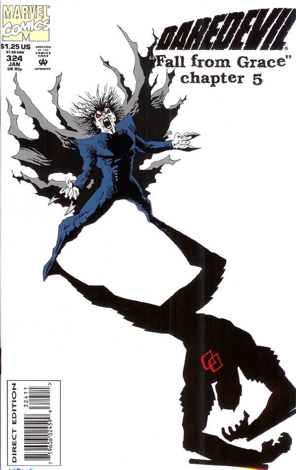
DAREDEVIL 324 cover |
McDaniel:
The design of the cover is very striking - the white neg space really helps pop the main players. While minimalist -
as are all these covers - the layering and rendering still allow the high contrast style to work fairly well (and it
looked very cool in black and white, too).
The vampire Morbius figure casting the heroic DD shadow does NOT imply some sort of revealed, secret, personal connection (though, truthfully, if there WERE that connection, this would simply be a BRILLIANT cover!). The implication of the design is that Morbius' influence (symbolized by his shadow) is terrifying (symbolized by the agonized DD figure).
Chichester: This was a good one. Straddling reality and metaphor in a cool way. The jagged angles on
Morbius and DD create a nervy dynamic. Unsettling. You're on edge. A great sense of "stuff's happening between these two." Which is a
great setup for the final push to the finale next issue.
Certainly it could be interpreted as DD being some kind of reflection of vampy. But that doesn't play out in the story or in the
character history. Once you read the issue, I think the image reads in a lot more interesting fashion: DD shadowing Morbius. And
taunting him every step of the way! Probably more than the artists intended, but that's the fun thing about good art, isn't it?
Finding the unexpected. (Maybe I just think too much. |
DAREDEVIL 324 pg. 2 |
McDaniel:
As a visual storyteller, interesting moments present themselves when a story moves temporally or psychologically
(say, from past-to-present, or from delusional pov to omniscient pov). At these moments, the story usually quite
dramatically changes in tone, pacing and atmosphere. The opportunity visually is to capture those contexts and
visually reveal the change. I like to visually link story pages occurring in a context by amplifying common
elements, utilizing common page compositions or utilizing common border designs. Thus, when the context changes, the
pages visually change, too. I believe it enhances the reader's experience of the story: as the story modulates, so
too does the art.
Chichester: I was probably too fond of the flashback. A youthful indiscretion, as our past prez liked to
characterize his errors in judgment and indulgences in easy pleasure.
The flashback is an odd mutt of a storytelling device. Friendly and lovable in its own way, it promises an easy look back. A
comforting, close-loop between the then and now. But like a mutt, you don't always know where it came from. And maybe that junkyard
dog instead turns on you with teeth bared.
A bit overdramatic, no doubt. This guy here's not dangerous. But he's a bit scruffy and not quite housebroken. All the right
ingredients are here. The captions and dialogues are largely straight forward. In some instances, diner-quality meat-and-potatoes.
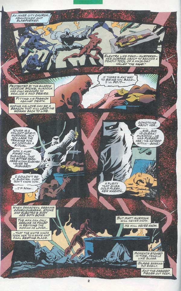
("When DD regains consciousness, Stone and Elektra's body are both gone." Hard to believe *I* actually wrote something that clear!
Kudos to Scott, as often, for translating my broad strokes into some singular moments. Especially here, where the need was for
exposition and recreation. (Versus wowsah and *creation.*) With all the issues and pages, I'm unsure why I waited until so late in
the game to establish this important backstory. I'm sure I could have spared a page or three from the run around with Crippler! LOL.
|
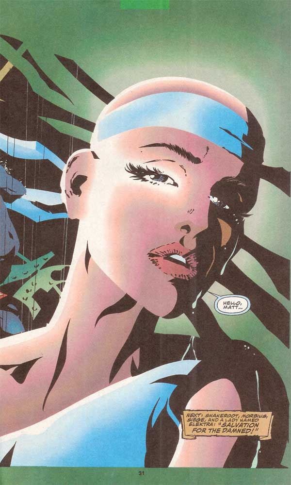
DAREDEVIL 324 pg. 31 |
McDaniel:
I think God blessed me to step out of myself and reach above my ability to pull off this portrait! I think her face
is full of emotion and is very captivating.
However, I think it actually looks even BETTER when viewed with its companion image on page 30. The two images were designed to flow together. The border of the image on page 30 is contracting - DD's view of the world is closing in to encompass only Elektra - and when the image melts into her portrait, all that remains is her face. In black and white, the power of the image far greater as the eye is steered over the initial meeting to Elektra's portrait, the neg of one image framing the positive elements of the next.
Chichester: Just the other day I was rudely reminded of the art "style" of the day, especially as it
related to females. Toothpick ankles. Elvin feet. Half-watermelons duct-taped to chests at awkward angles. Spines broken so these
caricatures could slinky forward and project their big-ticket items for the fan base to marvel over.
Laughable doesn't begin to describe it. (Although clearly profitable for some.) But it's in stark contrast to Scott's abilities, even
then in his career. And I wouldn't trade anything for what he accomplished here, after all our lead up. The simplicity of this
Elektra -- the beauty, the strength, the sadness. Imagine if she'd instead shown up as skank-du-jour? What a relief. What a gift.
|
Daredevil (and other related characters appearing) and the
distinctive likenesses are Trademarks of Marvel Characters, Inc. and are
used WITHOUT permission.
Copyright © 2009 Marvel Characters, Inc.
All
Rights Reserved. Visit Marvel.com.
COMICS:
Volume 1 | Volume 2 | Annuals
| Appearances | Costumes | Hardcovers | Key Issues | Logos | Origin | Price Guide | Recommended
|![]() Reviews | Secret Identity | Sales Data | Titles | Trades | Untold Tales
Reviews | Secret Identity | Sales Data | Titles | Trades | Untold Tales
![]()
CREATORS:
Cover Artists | Inkers | Pencillers | Writers
![]()
MEDIA:
Books | Cartoons | Computer Fun! | Movies | Music | Pictures | Sketches | Video Games | Wallpapers
![]()
FANS: Fan Art | Fan
Costumes | Fan Custom Figures | Fan Fiction | Fan Guitars | Fan Tattoos