| View previous topic :: View next topic |
| What is the best cover? |
| 107 |
|
16% |
[ 2 ] |
| 108 |
|
50% |
[ 6 ] |
| 109 |
|
0% |
[ 0 ] |
| 110 |
|
16% |
[ 2 ] |
| 111 |
|
8% |
[ 1 ] |
| 112 |
|
8% |
[ 1 ] |
|
| Total Votes : 12 |
|
| Author |
Message |
Kuljit Mithra
Hardcore

Joined: 29 Jul 2004
Posts: 1530
Location: Canada
|
 Posted: Wed Apr 01, 2009 3:04 pm Post subject: Djurdjevic Best Cover Poll Group 3 Posted: Wed Apr 01, 2009 3:04 pm Post subject: Djurdjevic Best Cover Poll Group 3 |
 |
|
Daredevil #106 moves on to the semi-finals from the second group...
Here's the third group... the poll will run for 7 days.
_________________
Kuljit Mithra
www.manwithoutfear.com |
|
| Back to top |
|
 |
Francesco
Underboss
Joined: 08 Jun 2006
Posts: 1307
|
| Posted: Wed Apr 01, 2009 3:25 pm Post subject: |
|
|
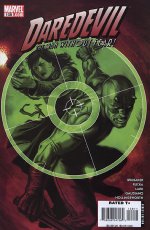
| for me it's #108, no contest. Splendid artwork, nice contrast of colors. Also I like the general concept behind it. |
|
| Back to top |
|
|
jumonji
Guardian Devil

Joined: 23 Sep 2007
Posts: 636
Location: Too close to the Arctic circle
|
|
| Back to top |
|
|
rgj
Hardcore
Joined: 29 Jul 2004
Posts: 1580
Location: The Rio Grande Valley of Texas
|
| Posted: Wed Apr 01, 2009 8:55 pm Post subject: |
|
|
Yeah, what they said.
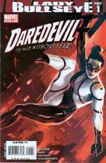
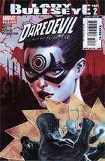
p.s. IMO, the two Lady Bullseye covers are very sub-par.
_________________
rgj |
|
| Back to top |
|
|
Dash
Flying Blind

Joined: 29 Oct 2008
Posts: 94
|
| Posted: Wed Apr 01, 2009 11:47 pm Post subject: |
|
|
| the variant wasn't bad of he 1st lady bullseye. 111 i believe |
|
| Back to top |
|
|
Darkdevil
Humanity's Fathom

Joined: 04 Apr 2009
Posts: 331
Location: The Bright, Sunny South
|
| Posted: Sun Apr 05, 2009 2:23 pm Post subject: |
|
|
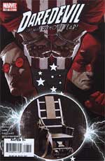
I'm going to dare to be different and vote for #107.
I like the duality of his face, the split nature that ends in the electric chair. It's looks cluttered, but to me, it comes together as a whole rather well. |
|
| Back to top |
|
|
jumonji
Guardian Devil
Joined: 23 Sep 2007
Posts: 636
Location: Too close to the Arctic circle
|
| Posted: Sun Apr 05, 2009 2:31 pm Post subject: |
|
|
| Darkdevil wrote: | I'm going to dare to be different and vote for #107.
I like the duality of his face, the split nature that ends in the electric chair. It's looks cluttered, but to me, it comes together as a whole rather well. |
Well, the idea is cool, but it's the whole Matt looking like Heinrich Himmler thing that ruins it for me:

_________________
The Other Murdock Papers |
|
| Back to top |
|
|
TsiFNorI
Flying Blind
Joined: 06 Apr 2009
Posts: 15
Location: Bloomington, CA
|
| Posted: Mon Apr 06, 2009 4:13 pm Post subject: |
|
|
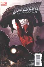
I have to vote 110.
To me, all the colors seem a little muted and Daredevils costume is a vibrant red and it just seems to have this maximum pop effect. I love how the picture centers around Matt. He's strong, and very fit and this cover shows that. He has had to deal with a lot of stress and I think that 110 epitomizes Matt's rage perfectly. The background of the cover looks pretty amazing as well. The cover shows a lot of story. overall 10/10 in my opinion.  |
|
| Back to top |
|
|
Darkdevil
Humanity's Fathom
Joined: 04 Apr 2009
Posts: 331
Location: The Bright, Sunny South
|
| Posted: Wed Apr 08, 2009 5:44 pm Post subject: |
|
|
| jumonji wrote: |
Well, the idea is cool, but it's the whole Matt looking like Heinrich Himmler thing that ruins it for me:
|
I could say something....but you really can't say anything good or cool about Nazis so you got me! 
Of the Lady Bulleyes covers, #112 is the better of the two. More variety and the reflections in her steel fan are cool. |
|
| Back to top |
|
|
|


