


J.G. Roshell is the resident 'Fontmeister' at Comicraft, and here he talks about designing the Marvel Knights DD logo and the Miller Visionaries TPBs.
Kuljit Mithra: Can you give a brief bio on yourself and what eventually led you to Comicraft?
J.G. Roshell: I grew up in Sunnyvale, CA, and grew out in Los Angeles. After graduating from UCLA with a degree in Design, I was doing various freelance design jobs, and playing guitar in a rock band that I thought would become my career. Meanwhile, Richard Starkings was creating his first lettering fonts, and looking for an assistant to do the inputting. He'd heard of my girlfriend through a mutual friend, and called to see if she was available. She wasn't, but fortunately I was sitting next to her at the time, and jumped at the chance to possibly get to letter a Spider-Man comic! Richard and I worked out of a spare room of his apartment for a year or so, while he tried to convince editors to accept lettering from a computer. Once they realized the two of us could turn a book around in half the time, more work started coming in. We got office space, he hired another person, and it just kept growing.
Mithra: At Comicraft, your title is 'Design Director & Fontmeister'. What responsibilities does your job entail?
Roshell: One of the great things about this job is that what I do has changed a lot over time. At first Richard and I were just inventing the methods -- while lettering, I was refining his fonts and creating new ones, and figuring out ways to get the artwork onto the screen as a template, anything to save time and make the quality as good as possible. As he hired more people to letter, and our profile increased, we started offering design services, and I moved on to letters page and trade paperback design, while doing just about all of Marvel's cover copy blurbs. These days I generate all of the original fonts that Comicraft uses (based on my own and Richard's ideas), create and maintain our websites (see www.activeimages.com for a complete menu), and still design lots of logos and TPBs.
Mithra: The main focus of our interview is going to be the Daredevil Visionaries: Frank Miller TPBs that you designed, but I'm sure people would want to know some of your other work. What are some of your more high-profile projects?
Roshell: I suppose the first high-profile project I lettered was "Marvels". Now I look at it and see a timeline of Richard's early lettering fonts. But that raised our profile in a lot of peoples' eyes, and our relationship with Kurt Busiek led to me lettering and designing all of the Astro City comics and book collections. I've done most of Marvel's trade paperbacks for the last 2 or 3 years, as well as dozens of logos, and the letters page and gatefold templates that they still use. Last year, I created the CD-ROM that accompanied Graphitti Designs' Daredevil "Visionaries" hardcover, which was a huge project.
Mithra: When I visited the Comicraft web site, I saw that the company designed the new Daredevil logo. How involved were you with the design for the Marvel Knights imprint?
Roshell: I designed a lot of the initial Marvel Knights logos (Black Panther, Black Widow, Inhumans), did an update of the Punisher logo, and the logo and cover layout for the Punisher/Wolverine "Revelations" series. I also did the various Sentry logos, and just finished one for the new Ghost Rider series.
Nanci [Dakesian] and Joe [Quesada] are incredibly easy to work with -- they'll tell me if there's something specific they want, and if there isn't, they're really open to whatever ideas I have.
Mithra: Were there a lot of concepts? Why was this design ultimately chosen?
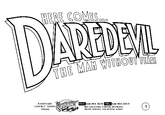
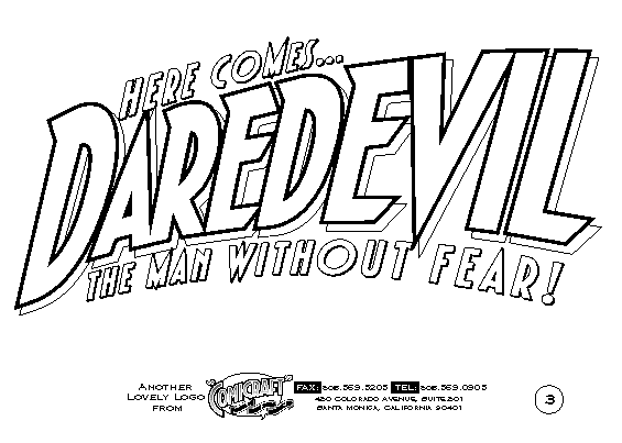
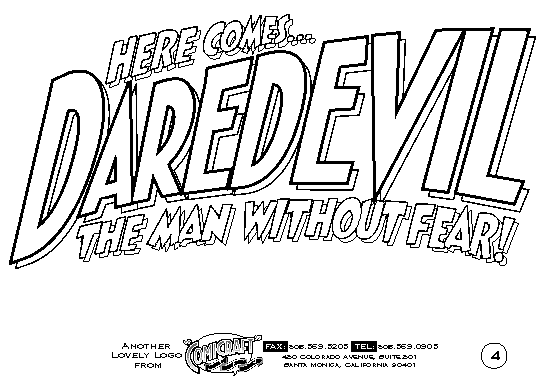
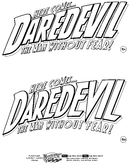
Roshell: This one went pretty quick -- Joe, as always, wanted something "fun but with a modern sensibility." I had an idea in my head to combine the best aspects of the DD logos I could remember -- from the original, goofy "Here comes..." one, to the square swooping one from the Frank Miller days, to Todd Klein's spikey one that was current at the time -- and try to make the ultimate, definitive Daredevil logo.
I started in Adobe Illustrator with one of our fonts (DutchCourage-Lite @ www.comicbookfonts.com), and added sharp corners at the tops of some letters. I swooped it at a couple of different angles using KPT (now Corel) Vector Effects "3D Transform" plug-in and the Free Distort plug-in. Joe liked the angle of #3, and after that it was just a matter of refining the letter style until it had enough "boldness".
[JG Roshell kindly provided these gifs of logo designs -- Kuljit]
[ Design 1 | Design 2 | Design 3 | Design 4 | Design 5 ]
It's lasted a couple of years now, and hey -- it's there on your site! -- so I guess I succeeded to some degree.
Mithra: I'm sure a lot of people are unsure as to the process involved with making a logo. Do you draw it by hand and then 'create' the font on computer? Is this how it is done?
Roshell: It totally depends. Often if I start right away with the computer, it's too easy to get locked into a rough idea because it looks "finished." Most of the time I'll sketch with pen on paper for a while, jotting down ideas and playing with letter shapes. Or if I'm totally stuck for ideas, I'll type out the word in a bunch of different fonts and see what jumps out -- often something seems to suit the feel of the book, or the letters fit together nicely, and I'll develop it further from there. I've found successful logos seem to come from a strong concept or idea, combined with a lot of refinement to get it just right.
Most of the time I send an editor 3 or 4 rough ideas, they tell me what they like or don't like, and I do one or two finished ones from there. And I always save my work in progress -- a rejected idea from one logo is often perfect for another one down the line!
Mithra: Onto the Visionaries TPBs... when you were given the task of designing the books, were you given any special instructions from Marvel as to what should and shouldn't be there?
Roshell: Not at all -- TPB design for Marvel is almost always open for possibility, which makes designing them a lot of fun. All Marvel editors usually require is that the proper info be in the proper places. And my own requirement is to include all the cover art whenever possible -- I personally feel ripped off if I buy something that isn't complete.
A TPB or hardover is a lot like a "frame" for the story -- you're setting up a visual mood before the story starts, and also giving it a more permanent housing. Aside from comics, I'm into all sorts of visual genres -- Art Nouveau, old circus posters, pulp paperback book covers, 1900s "general store" collectibles, all sorts of stuff -- so I like to open one of those kinds of books and find something that's appropriate visually or thematically to the story we're reprinting. I get to play at recreating a style I like, and hopefully the story gains an extra dimension from the presentation.
While Polly Watson was collections editor at Marvel, every time she'd call I'd say "so when are we doing the complete Frank Miller?" It became a joke, because we both knew it had to be done -- the old TPBs had all sorts of gaps, with entire stories re-dialogued to make the books work as "self-contained" stories. I think it was Joe Quesada that finally made the "Visionaries" books happen. He's such a fan of Frank's run, and probably wants to have it in his collection as much as anybody.
I felt some extra pressure finally designing these books, because I wanted to do justice to the material inside, and knew that a lot of people would be buying or seeing the book, (including Frank Miller!) so I had to do a perfect job. I sat down with my old DD issues, as well as whatever other Miller stuff I had, just to get a feel for the graphic sensibility of his stories. Aside from the titles, the old Daredevil issues don't have any lettering design, but the Sin City presentation always has a real basic, bold, sans-serif font kind of look to it. It's reminiscent of old pulp novels and movie posters without being that specific.
Mithra: What were some of the ideas you initially had for the design and why didn't you go with them?
Roshell: Sometimes I'll throw in every idea I have, and then remove stuff that doesn't work, but on this one I was so eager, I figured if I didn't keep it stripped-down from the start, I would just go out of control and be left with no idea what to do. So I went really simple -- almost boring simple, really -- and waited for something to happen that would make it visually interesting. As a result, there wasn't much to be rejected or left out.
Mithra: Can you into detail as to how you created the full page 'DD' logo that goes at angles?
Roshell: I drew the DD logo in Illustrator based on the new cover art, and then gave it perspective using the "3D Transform" plug-in. I tried a couple of different angles, and wound up using them all in different places throughout the book.
Mithra: For each of the issue covers, the image is at an angle and the number and date is displayed. Why'd you choose to display the covers like this? I noticed most of the text (table of contents, back cover) as well, go at angles.
Roshell: Well, that old Daredevil logo goes at a really unusual angle -- I was trying to get the credits and other text to match it, and having a terrible time. So I was just browsing through (okay, reading) the stories and noticed how, though Frank's panels were all squares and rectangles, what was in the panels was drawn at all sorts of wild angles. Rather than looking straight on at something, he would find ways to go above or below it, or rotate it, and that way even if Matt and Foggy were standing around a room talking, it would seem really dynamic and interesting. So I tried skewing text at any angle other than the logo, and once I added the old corner box illustration (gotta be complete!), the extreme angles of the figure and the buildings made it all fall into place.
Mithra: Did you have to take care of page placement and scanning the original art etc.?
Roshell: Fortunately, no! All of the story pages were handled by Marvel and the Bucce [Steve Buccellato].
Mithra: And finally, is work on Volume 3 already under way? What's next in terms of design work for you?
Roshell: I've got the cover art, but since the interiors won't be color-separated for a couple more months, I haven't started on the design yet. Marvel's got lots of other stuff in the pipeline first, and of course whatever's most urgent gets the attention. I've got the Sentry TPB coming in, I've been working on the covers for the Kevin Smith Graphitti Designs/View Askew books, and handling the usual slate of logos and stuff. I'm also in the middle of creating Joe Quesada's personal website (www.joequesada.com) which should be up in a few weeks.
----------------------------------------------
(c) Kuljit Mithra 2001
Daredevil:The Man Without Fear
http://www.manwithoutfear.com
----------------------------------------------

Daredevil (and other related characters appearing) and the
distinctive likenesses are Trademarks of Marvel Characters, Inc. and are
used WITHOUT permission.
Copyright © 2024 Marvel Characters, Inc.
All
Rights Reserved. Visit Marvel.com.
www.manwithoutfear.com is owned and operated by Kuljit Mithra.
Web site is © Kuljit Mithra 1996-2025.
Keep up to the date with your trusted Daredevil source ManWithoutFear.com on  and
and 